A New Pantone Color Whose Courageous Presence Encourages Personal Inventiveness And Creativity.
What is the Pantone color for 2022?
Introducing the newest original shade of blue for the 2022 year, Pantone 17-3938 – Very Peri, a dynamic periwinkle blue hue with a vivifying violet red undertone. Blending the faithfulness and constancy of blue with the energy and excitement of red, this happiest and warmest of all the blue hues introduces an empowering mix of newness.
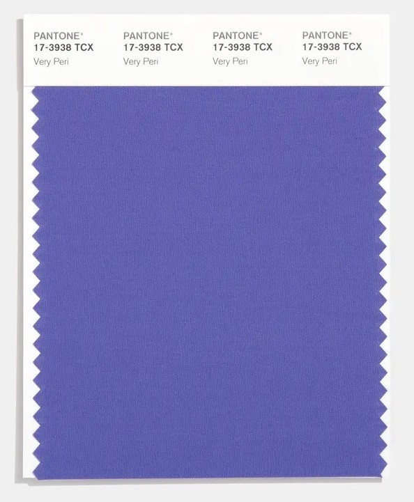
As we embark on a new year, we cannot but wonder about what the future holds. With global unrest, and our high-stress, fast-paced, uncertain, constantly evolving culture, we seek refuge in the familiar.
Colors are not only about aesthetics – they carry a message. They have the power of communicating and even influencing, with that in mind, Very Peri reflects our current period of changes. When after a long time of isolation we have a glimpse of how life is becoming, merging our physical and digital lives in new ways. Very Peri “illustrates the fusion of modern life and how color trends in the digital world are being manifested in the physical world and vise versa”, accordingly to Pantone.
“As we move into a world of unprecedented change, the selection of Pantone 17-3938 – Very Peri brings a novel perspective and vision of the trusted and beloved blue color family. Encompassing the qualities of the blues, yet at the same time possessing a violet-red undertone, Very Peri displays a spritely, joyous attitude and dynamic presence that encourages courageous creativity and imaginative expression.”
Leatrice Eiseman – Executive Director of the Pantone Color Institute
Color Psychology
Although labelled as a blue hue, Very Peri has a purple feel and look with a joyous and vivacious rich tone. We know from color psychology that purple represents spirituality, wealth and enchantment. Historically favored by those with a taste for the arts. Differing tones of purple can evoke various emotions, such as a lighter violet tones symbolizing ethereal, meditative states, whilst darker more brooding purples shades are mysterious and regal.
Very Peri injects a sense of playful freshness into home interiors, Enlivening a space through unusual color combinations. A versatile shade that animates our creative spirit, Pantone 17-3938 – Very Peri is suited to an array of different materials, textures and finishes, providing a pop of color, whether introduced through a painted wall, accent furniture or home décor, or acting as an intriguing and eye-catching accent in pattern.
When applied to interior design, purple tends to suit more luxurious and glamorous styled spaces with an emphasis on drama, allure, and sophistication. Very Peri within interior design would be as bold as you can go, a design statement that commands attention. Purple interiors can sometimes feel a little out of ones ‘comfort zone’ however if used smartly and stylishly a space that encompasses this hue can be inventive and courageous.
How will Very Peri look in interior design this year?
Pantone Color of the Year will be added into the Pantone Fashion, Home + Interiors Color Systems, the most widely used and recognized color standards system for fashion, textile, home and interior design.
We’ve already begun to see this energetic influence in art, especially with a big focus on the future. This subtly colorful surrealist style will only get more and more popular this year. You will see this color popping up in rooms like home offices or bathrooms, incorporating this color in spaces to give a futuristic and peaceful yet inspiring vibe. In home offices, people will want to extract the inspirational energy from Very Peri. While in bathrooms or vanity areas, the calming nature will be an asset.
This new hybrid of blue, red and purple has the merit of matching perfectly with a wide rage of shades. The easiest combination is with white and soft tones of sand, camel and beige, but the one with the warmest tones of brown, from coffee to caramel and cocoa, is also very effective. Decidedly fresher and perfect for giving a contemporary twist to the rooms is the combination with green, pink and even orange and yellow. To help you make the right choice, Pantone has developed 4 different color palettes.
The first color palette is called Balancing Act and includes Lilac, Pink, Purple and Granite Green. The second is called Wellspring and is inspired by nature with shades such as Chai Tea, Treetop, Foliage or Eggshell Blue. The third palette is called The Star of the Show, a sophisticated selection of Taupe, Charcoal Grey, and Sand White. Finally, the last palette is called Amusements with its Pink Flambé, Iced Coffee, Tourmaline, and Tawny Orange it is perfect for those who are not afraid to be daring.
Very Peri Décor Tips From Pacesetter Homes
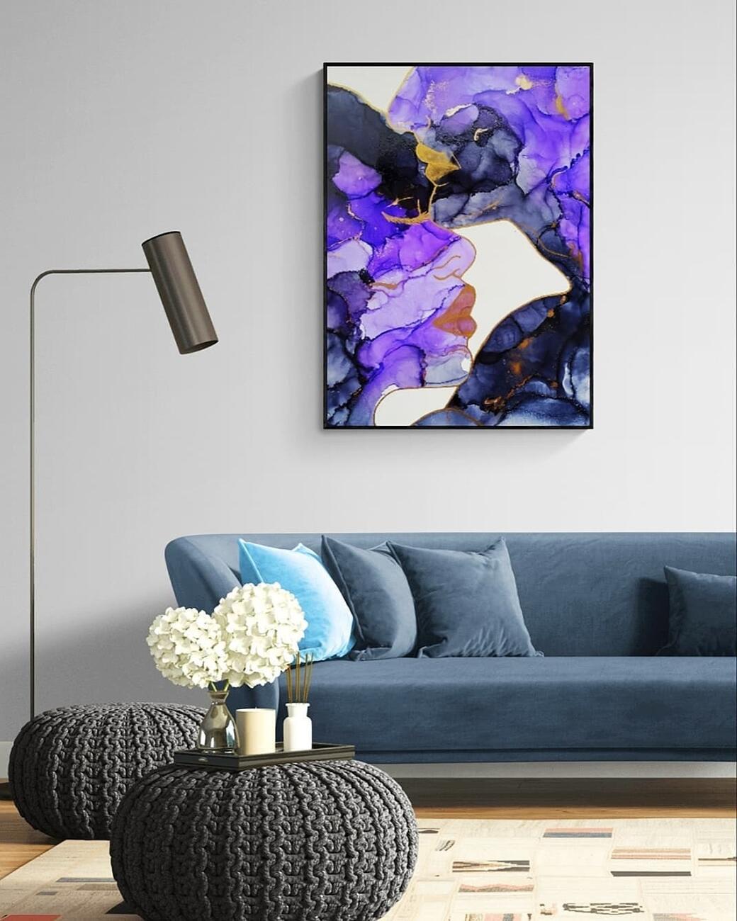
Wall Art
A straightforward method of adding Very Peri into your home is adding a piece of art that contains the color tone. This way you can test how you feel about Very Peri in your space, even moving it into different rooms as an experiment, making sure you feel assured in your color choice.
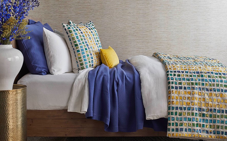
Accessories
Try small touches of Very Peri within your home accessories. A cushion or throw for playful comfort or an illuminating lampshade, these are quick and easy ways to embrace the purple trend without over committing.
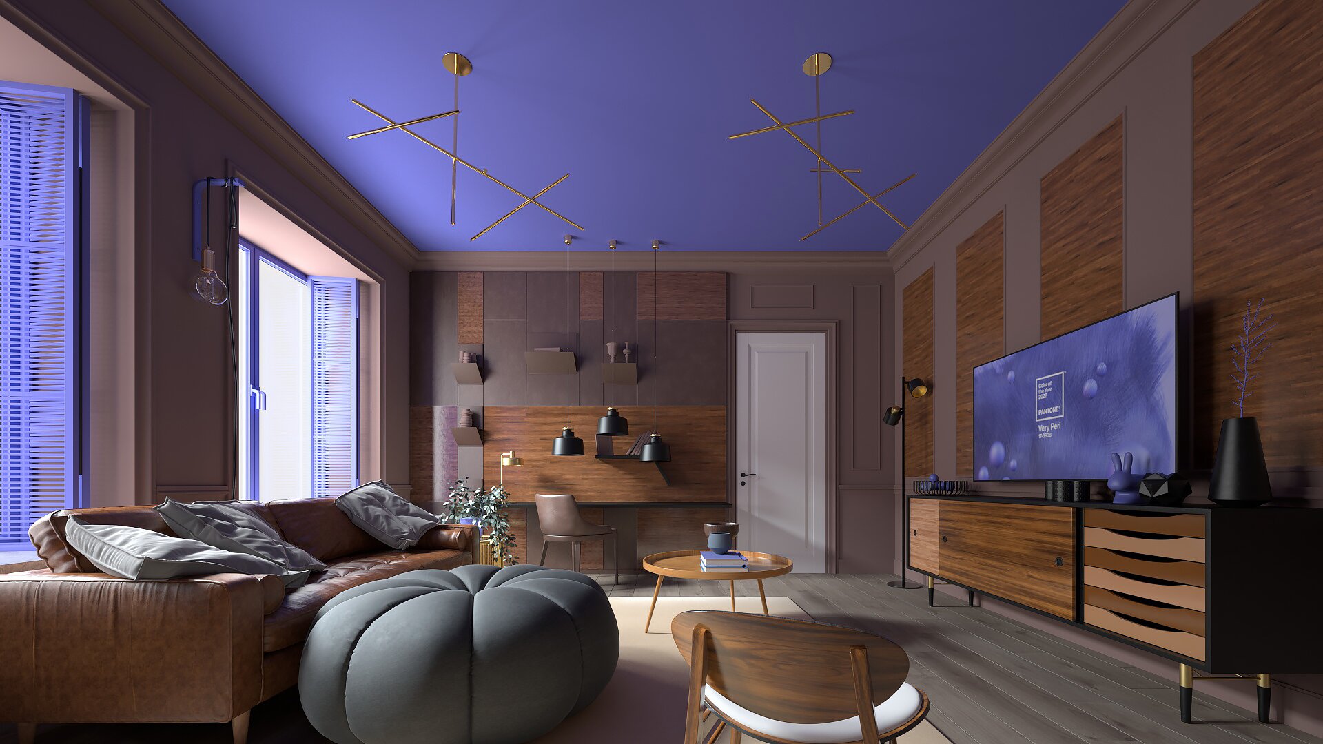
Accent Walls
Very Peri is not only a very versatile shade, but, thanks to its periwinkle blue base, it is also good at instilling a sense of comfort and tranquility. For this reason it is highly recommended for rooms such as living room, bedroom or study. Once you have decided on the room and the match that is right for you, the next decision to make is whether to try painting one or more walls in your home. Sometimes a simple color accent is enough to give a room a new twist, Pacesetter Homes advice is to try a single wall and if the result is satisfying, continue with the others.
Pair with Blue
If you are not sure how to team Very Peri with other colors and do not want to go for a safe bet with neutrals, why not pair purple and blue. These shades tend to feel jubilant and interesting within interior design as they sit next to each other on the color wheel, therefore they complement each other’s spirited and lively tones.
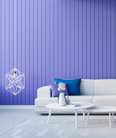
Different shades of purple
Pantone’s Color of the Year opens the way for a whole series of shades poised between purple and periwinkle blue. If you are looking for a wow effect and are not afraid to dare the minimalist diktats that revere the zen of a home dominated by neutral hues, then why not play by layering different shades of the same color? Pinterest and Instagram offer many ideas on how to recreate captivating environments by adding walls, furniture, plaids, pillows and other small objects of decoration starting from dark purple passing by Very Peri and arriving up to lilac or wisteria.
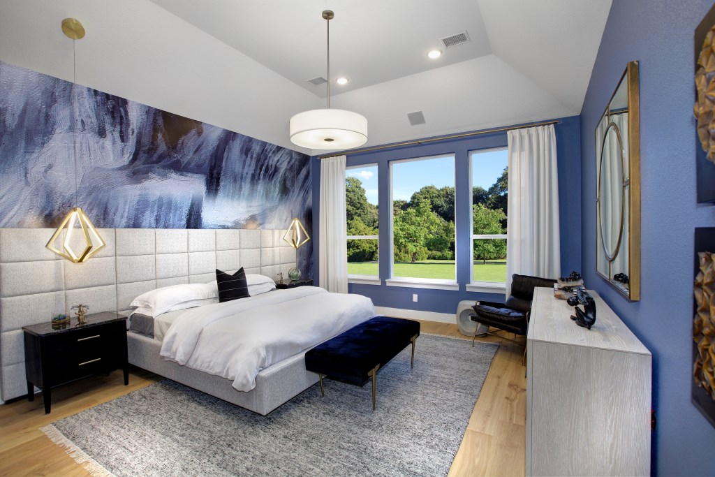
Whether you are looking to make a major change in your home interiors or simply need a refresh with a few new home accents, PANTONE 17-3938 Very Peri can provide the inspiration and versatility you need.
View more blogs by Pacesetter Homes.
